Cerebral Mental health Assessments

Cerebral offers online psychiatry and therapy provided by mental health professionals to help treat a wide range of mental health conditions. As the lead designer in Growth, I led the redesign of mental health assessment initiatives, resulting in an 88% increase in signup conversions.

TIMELINE

2 months (April 2024 - June 2024)

My Role

Lead product designer

Core responsbilities

product strategy, team collaboration, information architecture, user flows, visual design,  A/B testings

Problems

Mental health assessment is important because it provides a comprehensive understanding of an individual's psychological well-being, helping to identify potential issues and guide appropriate interventions. For customers, an initial assessment is necessary to determine if any symptoms are present and what steps should be taken next.

Our mental health assessment pages have been among the most highly trafficked, with thousands of visitors in the past 30 days. However, the arrival-to-lead conversion rate remains low, indicating room for optimization in encouraging users to take the next step.

Goals

By optimizing these pages for lead generation and SEO, we can boost sign-ups and engagement, effectively converting high traffic into valuable leads.

Solutions

1. Redesigned the landing pages to educate users on each symptom, highlight how Cerebral can help, and strengthen trust through social proof.

2. Created the result page to focus on understanding your score, outlining the next steps to determine if treatment is right for you, and motivating users to take action.

3. Moved the user sign-in to an earlier stage in the process, rather than after reviewing the results, to reduce drop-offs and prevent step overload.

End to end designs
View screener landing page -> Create an account -> Finish screener survey -> Analyze responses -> Consent and show results ->  See the results

Screener landing page

Screener result page

Impact

The designs exceeded our expectations, leading to remarkable results:

The redesigned ADHD screener significantly boosted user acquisition and lead generation, resulting in a 3.5x increase in SEO-driven leads in June compared to May and an 88% rise in conversions.

Encouraged by these results, we expanded the screener to cover symptoms like depression, anxiety, and bipolar disorder. The updated design was highlighted in company-wide announcements across our core site https://cerebral.com/ and blog.

Strategic process 1 of 3

1

Conduct a competitor analysis, perform a comprehensive audit, analyze user data, and create low-fidelities to establish the design direction

I conducted a competitive analysis to examine how products like Talkspace, Clinical Partners, and Headspace design their mental health assessments. Additionally, I referenced articles on psychology and human behavior to better understand the principles behind effective mental health evaluations.

I also reviewed the current experience to identify pain points and how it aligns with the overall user journey. Collaborating with the PM, I analyzed existing data and assessed the conversion rate, noting that only 10% of users click and few scroll on this page. Based on the research, I created several low-fidelity wireframes and discussed with stakeholders to define the direction.

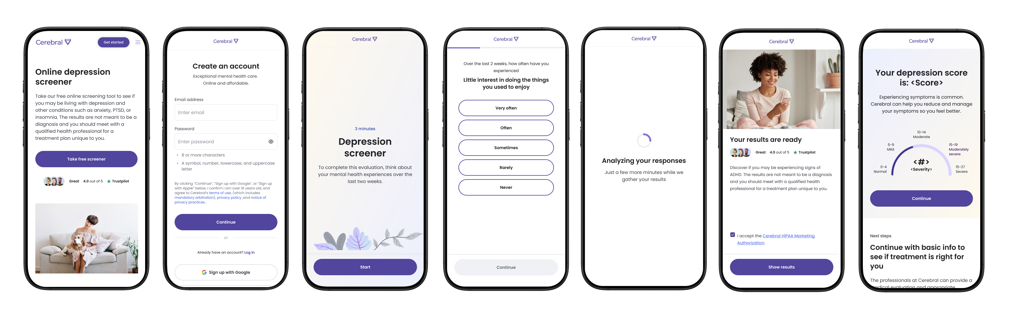
Before: The text feels overwhelming, hard to read, and poorly crafted

Explorations

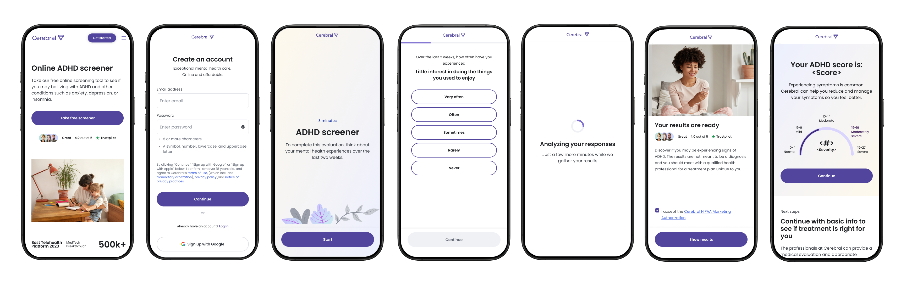
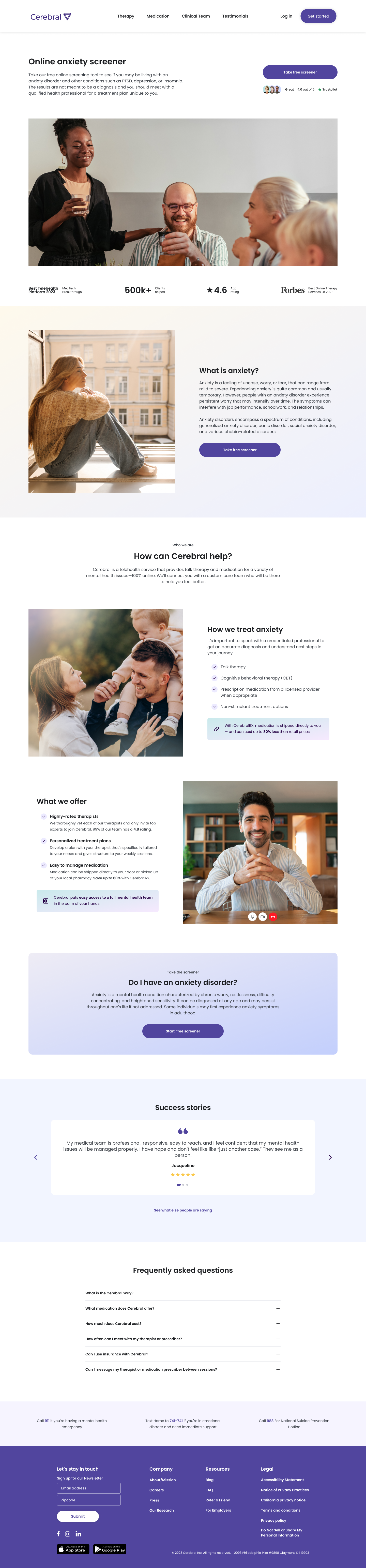
1. Focus on the symptom, its details, and how Cerebral can provide support

I proposed a storytelling approach that puts more focus on specific symptoms, Cerebral's treatment methods, and success stories to encourage users to engage with condition-related content and take advantage of free testing.

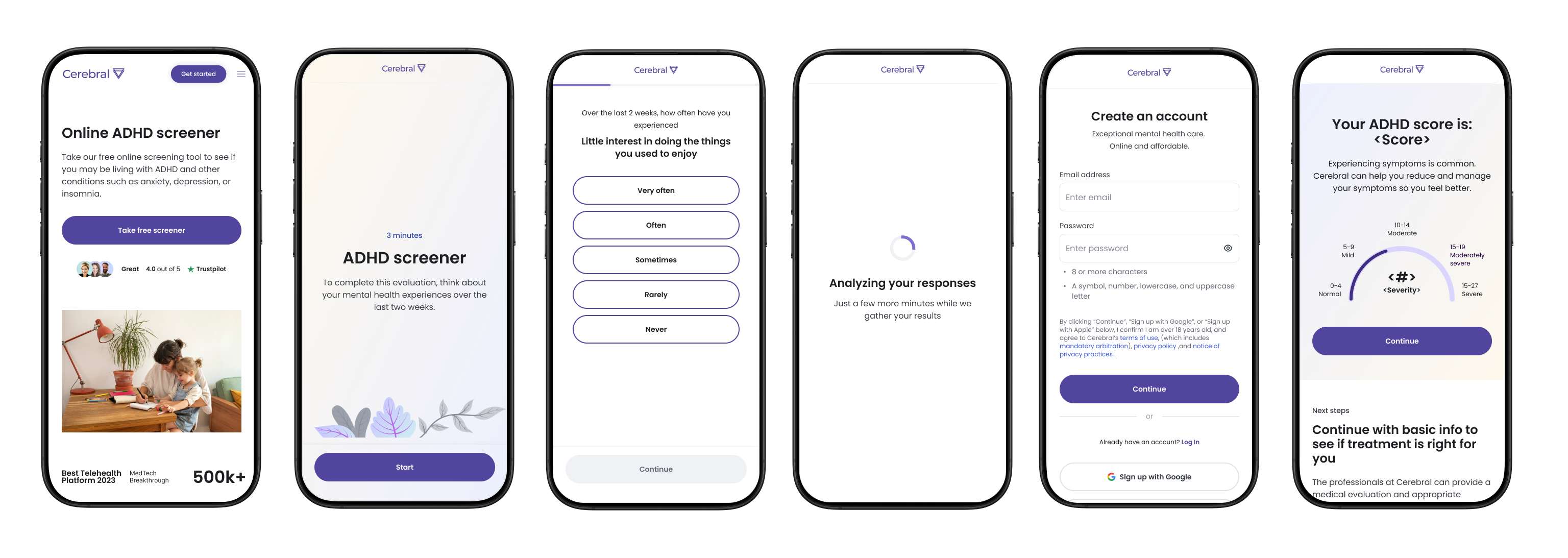
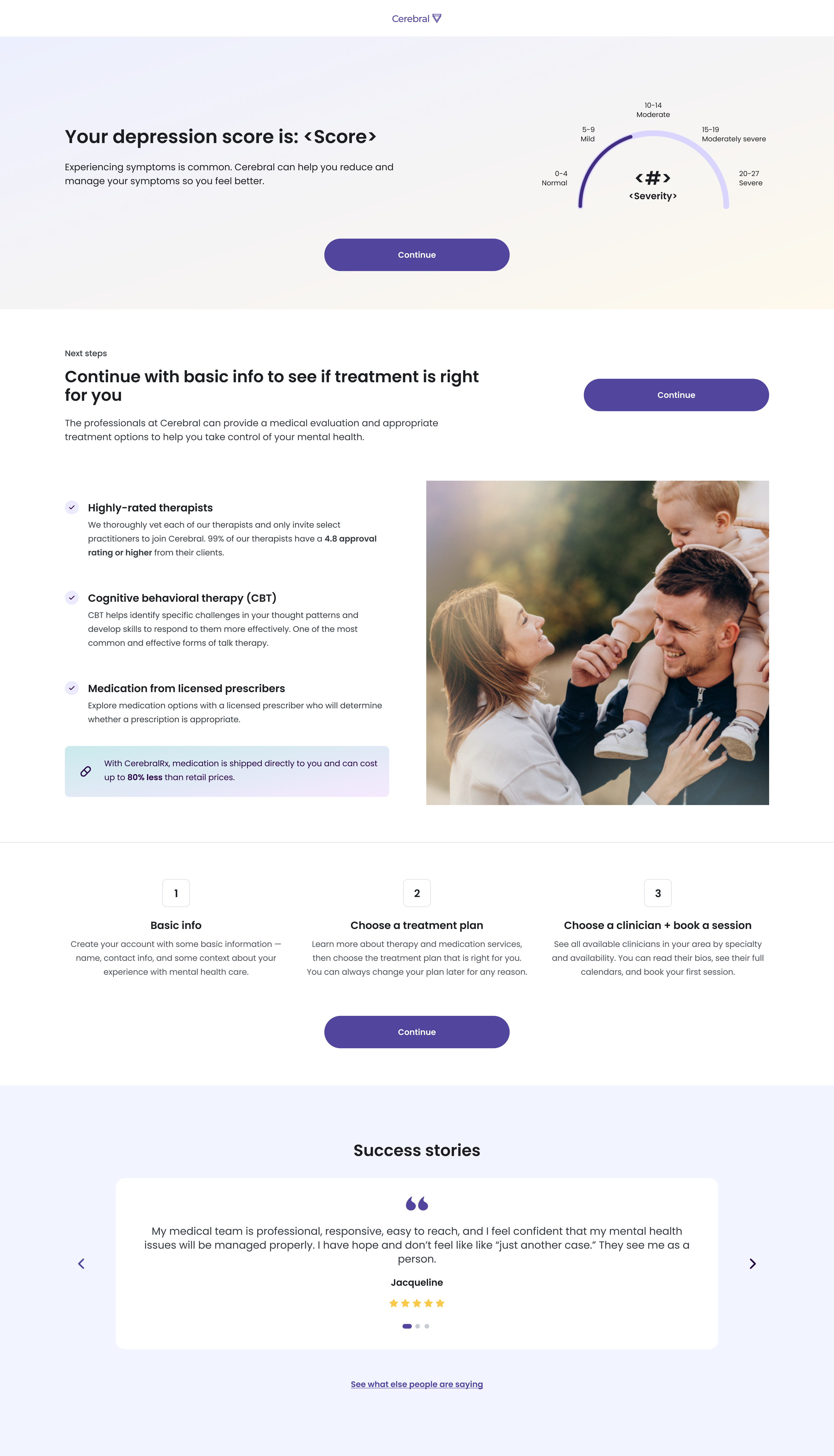
2. Leverage social proof and strengthen storytelling, concluding with a persuasive call to action that motivates users to take the next step

Another approach is to leverage social proof to highlight the product’s excellence by showcasing review scores and authentic customer testimonials. This not only builds trust but also influences potential customers’ decision-making, significantly boosting conversion rates. Additionally, I used powerful visuals and compelling content to emphasize the urgency and importance of completing the self-test, clearly outlining the steps visitors need to take and explaining why they should act immediately.

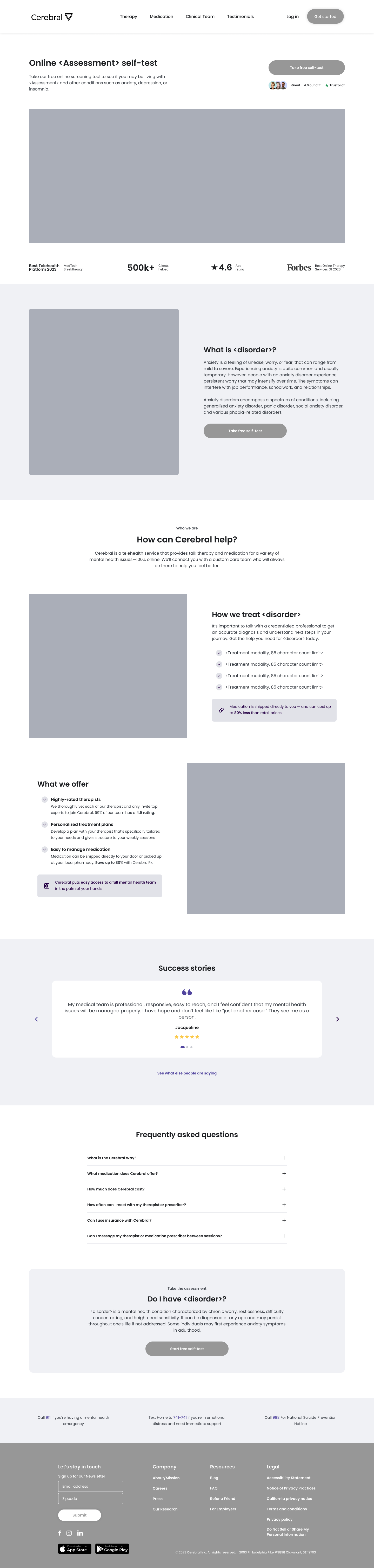
Approach and rationale for design decision-making

I presented both approaches to stakeholders, and we agreed that turning high traffic into meaningful conversions is critical for this project. We aligned on the importance of structured and persuasive storytelling, along with social proof, to influence potential customers' decision-making—ultimately driving more sign-ups and converting leads into paying customers. .As a result, we chose the second design as our template.

Strategic process 2 of 3

2

Tailor the UX to suit the unique requirements of different users

Each symptom requires unique treatments and diagnoses, so I collaborated closely with the legal and clinical teams to design a customized experience for users. From a product perspective, I worked hand-in-hand with my PM to ensure the experience aligned with both business goals and user needs. We tailored the UX to address the distinct requirements of various user segments, delivering a solution that effectively met their needs.

For instance, users who responded "very often" to the question "Thoughts that you would be better off dead or of hurting yourself" were guided through a customized flow, helping them recognize the need to seek emergency support through appropriate channels.

For users with bipolar disorder, the score is limited to indicating either positive or negative results based on the MDQ test. In contrast, for ADHD, depression, and anxiety, the score reflects varying symptom levels categorized as normal, mild, moderate, moderately severe, or severe.

Strategic process 3 of 3

3

Create A/B testings to experiment with different flows and elements

To drive more lead generation, we conducted an A/B test to determine which approach converts better—sign-ups or email leads:

(A): Emphasize signing up to view the results.
(B): Incorporate social proof to enhance credibility and encourage users to join the mailing list to access the results.

Not surprisingly, the data showed similar volumes between email captures and sign-up. Additionally, sign-ups tend to convert to paid customers more effectively than email leads, so we decided to integrate the sign-up page into the flow.

Emphasize signing up to view the results (A variant)

Encourage users to join the mailing list to access the results (B variant)

The sign-up page appeared later in the flow as part of the existing process. However, we believed there was an opportunity to improve the flow for better results.

To optimize sign-up conversion rates, we conducted an A/B test to determine the most effective timing for user sign-ups, testing two variations in the sign-up flow placement:
(A - Baseline): Displaying the sign-up screen late in the process, just before revealing the results.
(B - Test variant): Presenting the sign-up screen early, right after users click "Take Free Screener."

Displaying the sign-up screen early in the process (B - test variant)

Presenting the sign-up screen late in the process (A - baseline)

Big impact on conversions rate

After launching variant B, we observed a 3.5x increase in SEO-generated leads in June compared to May, along with an 88% rise in conversions than variant A.

Based on these insights, we proceeded with Variant B, which introduces the sign-up screen earlier in the process. Given the multiple steps required to complete the screener, drop-off rates were higher in the later stages as users experienced fatigue. Placing the sign-up earlier proved effective, as users did not perceive it as overly aggressive.

Reflection

Embrace the experiments:  Consistently aim to enhance the experience, drive design experiments, and shape product decisions through data-driven insights.

Storytelling is key:  Effective storytelling on a landing page is essential for boosting conversions by crafting a compelling and relatable narrative that resonates with the target audience. Developing multiple variations to present the narrative and clearly communicating the trade-offs of different approaches are key to success.

Prioritize user needs: Even though the growth project focuses on improving conversion rates, we shouldn't always prioritize business needs over user needs. Instead, we should take a proactive approach by addressing user needs based on target audiences. This ensures we deliver well-crafted solutions that lead to the best outcomes.